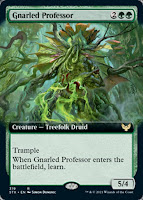
Today, I received my order of "mystical archive" Strixhaven cards. They're both beautiful and annoying, for reasons I'll discuss below. But first, a primer on the Magic card frame.
Magic has had three main frames in its lifetime:
Frame 1 (1993-2003)
The classic look for the first decade, this first frame underwent a few changes in its 10-year run (like bolder print, set symbols, card numbers, and rarity colors), but retained the main look until . . .
Frame 2 (2003-2014)
Frame 2 was a major change, adding boxes to highlight name, type/set, and power/toughness. It would undergo a minor change with . . .
Frame 3 (2014-present)
Frame 3 made the black border a little smaller and changed the bottom to make the information machine-readable. It also added a foil stamp (not shown in the example) for rare and mythic cards.
Occasionally, there were cards with different frames released, but those were reserved for promos or special events, so these three above frames were how 99.999% of Magic cards looked.. Until 2019.
In 2019, Wizards made a
major announcement relevant to frames: the addition of new frame treatments: borderless planeswalker cards, extended art cards, and "showcase" cards:
The first two are intuitive (and I really like them). The showcase cards started with Throne of Eldraine. From the above link, these cards are "not actually one treatment but a catch-all term to cover a variety of different treatments. Here's what a showcase card will be. For each set, we're going to come up with one or more cool treatments that embody the spirit of the set." These showcase cards are variations, produced in addition to the normal frames. I show Eldraine's showcase look above; below are some others from subsequent sets. Note how each has a different frame, and the art itself is of a unique style:
Since Eldraine, each set has had between 16-40 showcase variants (according to
this site). Strixhaven, in place of showcase cards, has 60+ "mystical archive" cards, which look completely different. Check one out:
I like it! But I don't. While it is done well, it 'clashes' with the standard frames (and showcase variants). I deliberately provided only green cards as examples today, and you can see just how different they all look- imagine having a hand full of them in a game. They're functionally identical, but aesthetically clashing.
A friend mentioned that he wishes these new frames would be limited to a separate, self-contained set. I agree. And, in fact, I think Wizards is heading that direction, with their recent announcement to handle licensed properties (like Warhammer and Lord of the Rings) with separate sets and new frames. They'll look different but have the same mechanics of regular Magic. But they'll be self-contained, and that's the important bit.
Silly as it sounds, part of Magic's draw is the card frame and art. The mechanics alone are excellent and admirable, but the presentation matters, too. So while I enjoy the different treatments we've been seeing in their own way, it's producing a visual mess when the cards are played in the same deck. (And I imagine it's also confusing new players.) But time will tell how this pans out.


